So if interiors arn't your thing and you havn't a clue what I'm going on about, here's some examples of what's been happening in interior decor for the last couple of years:
Bus rolls:
 | ||||||
| Image via Desire to Inspire |
 | ||||||
| Image via Manalo For The Home |
Appropiate words in appropriate places:
 | |||
| Image via Manalo For The Home |
Favourite song lyrics:
 |
| Image via theloveshop on Etsy |
 | |||
| Image via theloveshop on Etsy |
 |
| Image via Design Sponge |
 |
| Image via Ikea |
Wow! Lots of inspiration there, right?
Well, you probably have already guessed that I'm quite attracted to graffiti art and for those of you familiar with graffiti and street art, you will know it can take many forms, though the origins of graffiti have always been centred around letters and writing. Just see my last post. (And if you're not familiar, you are now living evidence of the phrase "You learn something every day" Hooray, you!)
I have been thinking recently about making some artworks for my home combining all these things and so, to invite some major inspiration, have been waiting with absolute bated breath for this to arrive on my doorstep:
And it's finally here! It's "Street Fonts" by Claudia Walde and boy, oh, boy, it was just as good as I thought it was going to be.
One hundred and fifty-four very creative artists - all with roots in graffiti culture - were given the same brief, according to the foreward;
"... to design all twenty six letters of the Latin alphabet. How they approached this task and selected the media with which to express their ideas was entirely up to them."
And they are pretty amazing!!
Here's a sneak peek at some of the images. Some of the styles are very traditional old school graffiti-esque:
 | |
| by Atom One from Dortmund, Germany |
 |
| by Bonza from Strasbourg, France |
 |
| by Jorz from Melbourne, Australia |
While some are more design, font and typography oriented. I think this would make a pretty cool framed print:
 | ||||
| by Aske from Moscow, Russia |
These next two take the cake for cuteness:
 | |
| by iLK from Paris, France |
 |
| by Popil from Shanghai, China |
And I simply cannot stop looking at these ones for their cool black and white graphic complexity:
 | |||
| by Casper from Osaka, Japan |
 |
| by L'Atlas from Paris, France |
 |
| by Xpome from Sofia, Bulgaria |
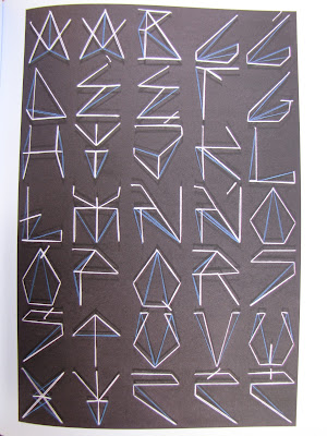
Then there are the ones that are fabulously ace works of art in their own right. Paism used 246 nails and yarn to create this alphabet:
 | ||
| by Paism from Gryfice, Poland |
And Ripo, originally from New York City but now living in Spain, used white enamel paint on mirrors to create his alphabet. He then put up the mirrors on the streets of Barcelona and took pictures of the reflections.
 |
| by Ripo from New York City, USA |
He explains the concept thus: "Graffiti usually fills in the "negative" or forgotton spaces of cities - ignored parts of signs, doors, walls...I played off this concept by painting in the negative spaces of the letters and letting the city fill in the rest."
 |
| Detail from alphabet by Ripo |
WOW, right? Very clever and really unexpected, don't you think?
So which is your favourite? Does this make you see graffiti and street art in a different light? Do you have letters or writing or alphabet prints adorning the walls your home? I'd love to hear about it if you do.
Now I'm off to browse through my new book really carefully and soak up all that lettery goodness!

Nice post! I find the evolution of different fonts/text fascinating! Thanks for introducing me to some new ones!
ReplyDeleteWow indeed. Amazing!
ReplyDeleteI love the mirror letters, and the idea behind it. Somehow very moving as well as beautiful. Really love the dynamism of Aske's version, and the sheer awesomeness of L'Atlas. I'm blown away.
I have some antique printing press letters in my kitchen and I move them around like building blocks - I've got the initials of everyone in the house, an ampersand and the letters L O V E. I love rearranging them while I'm waiting for the kettle to boil.
Yes, gorgeous. I have been looking at the same kinds of things.
ReplyDeleteSo much good stuff here but the Barcelona alphabet is sticking with me.
ReplyDeleteI'd hang the cogs one on my wall, but they are all really cool..
ReplyDeletei like the mirror letters, looking forward to seeing what you do with letters.
ReplyDelete